


")


In this post I will refer to my excel-based perceptual map template which you can order for just $19. 
Perceptual maps, often called product positioning maps, have been used by marketers for years to better understand a market landscape and know how customers view your products versus the competition. In this post I’ll show how to create your own map and illustrate how using perceptual maps can drive innovation efforts and help you position your products successfully in your market space.
What Is A Perceptual Map?

FREE VIDEO TRAINING FOR INNOVATORS
Over 100 Slides Free and Downloadable as a PDF
A perceptual map is simply a graph of how various products (or brands) are perceived by customers along 2 or 3 product attributes or customer satisfaction variables. These graphs provide a quick method to understand competitive positioning, open areas within the market and relative comparisons of attributes that are important to customers.
Below is an example of a blank perceptual map:

Types of Perceptual Maps
There are several types of perceptual maps – from simple maps with just two variables (similar to the one above) to maps created using sophisticated multivariate factor analysis and statistical software packages such as Minitab or SPSS. Though I think those sophisticated methods are valuable, for purposes of this post I will refer to simple maps consisting of 2 and 3 variables. Even with just 3 variables included in the analysis, marketing managers can gain deep insight into the dynamics of a certain market and spot future opportunities for growth.
Before Diving In – Start With A Marketing Question (Or Hypothesis) In Mind
When creating a perceptual map it’s often helpful to ask yourself what you hope to learn from it. Do you want to see how competitors stack up in the minds of consumers? Do you hope to identify potential opportunities for growth or new product development? Do you want to refine your branding or marcom messaging to shift perceptions of your brand in a certain direction? Or do you simply need to better understand a new market in general so you can know the landscape before investing in a new space?
Perceptual maps can help answer all of these questions and more. The next step is to create your own…
How To Create A Perceptual Map
There are only two things you need to make a map – data from a reliable source, and a template. I’ve taken care of the template for you, all you really need to do is come up with the data and determine what variables or attributes you want to display.
When it comes to generating data you have three options:
- Go with your gut (based on your experience in the market)
- Use secondary research data (customer satisfaction data you can find online or in market research reports)
- Generate your own primary data (create a survey from scratch and survey the market to determine variables and attribute ratings for a list of products/brands)
Going with your gut is sometimes appropriate – especially if you already have extensive experience and knowledge of your market and the dynamics within it. However, if you’re analyzing markets that you are only vaguely familiar with it’s best to rely on either secondary research reports or primary data you’ve collected yourself in surveys. For most needs, I expect secondary sources to be sufficient unless the data is old or is missing variables you want to study. In those cases, primary data is the best route.
As an example for gathering data to use in this post, I did a Google Image search for Consumer Reports and found ratings for beef jerky that were structured perfectly for translation into a perceptual map of the beef jerky market. This intrigued me because even though I like beef jerky, I have no idea what the market for beef jerky is like and I was curious to see what I could learn by building a perceptual map of this market.
The table is below:

Now that we have our secondary data in hand, the next step is to choose what variables to display on the map. The best variables to choose can vary depending on what you’re hoping to learn from the perceptual map. For example, if you wanted to see how the competition stacked up from a purely health perspective, you might choose to analyze the three variables of calories, fat and sodium content. On the other hand, if you’re like me and you just want to learn the basic dynamics of a market, it’s usually best to rate the attributes that are most important to the average consumer’s experience – in this case I’ll assume those attributes are taste and cost.
This assumption may or may not be correct – the average beef jerky consumer could value cost and calories even more than taste but this is where I’ll go with my gut and put taste as the most important attribute and the others as follows in the table below. In a perfect world of vast time and money and if this were a market that I really was interested in, I would design my own beef jerky market research survey. In it I would first ask customers what the reasons for purchasing the jerky were, then ask them to rate those reasons in order of importance and then ask them to rate each competitor on those reasons as well. That’s what I might do if I worked for ConAgra (Slim Jim’s) or Jack Link’s but for this post I’ll just make an assumption and move on.

With the variables identified and listed in order of importance, we now need to enter the data into the template as follows.
 Notice that as the data is entered, a preview of the map appears below. In this image the preview is complete but that’s only because the rest of the data is already filled in on the right side as well.
With regards to taste, I took a little liberty with the Consumer Reports data by assuming the bottom of their list really meant “poor taste” rather than just “good” as it states in the table. This is helpful with the map to show a little more variance among the variables.
Now that we have the map parameters entered, the next step is to enter the comparative data. Since this map uses a bubble chart with bubbles that can be sized differently, I can analyze a total of 3 variables in the following manner:
- Taste represented on the horizontal X-Axis
- Cost (or price) represented on the vertical Y-Axis
- Sodium content represented by the bubble size
Typical convention for bubble size is for it to represent relative market share or sales but since I don’t have that data, I’ll show sodium content instead.
When you look at the template you’ll notice that it asks for 1-10 ratings of each of the attributes. You’ll also notice that the order of what number represents best (1 or 10) is dependent on how you decided to label the horizontal axis (left and right sides). In this example use of the template, poor taste would score a 1 and best taste would score a 10. To arrive at those numbers I translated the taste ratings below into scores between 1-10. Because I don’t have the more detailed data behind this table, this is the best we can do for now and for our purposes this should be a reasonable approach.
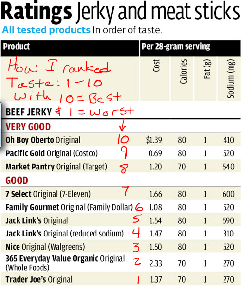
The next piece of data to enter is cost. In the Consumer Reports list cost is shown in absolute terms. Given that the template accepts numbers between 1-10, we will need to normalize the data to make it fit the template. This is easily done by entering the actual cost data into the blue column (the blue column is a normally empty column shown in the image below) and making the “Vertical Axis” column a formula that divides the actual cost by the highest cost (thus giving a percent of maximum cost) and then multiplying that number by 10 to give a 1-10 score.

Now for the third variable, because there are few differences in calories and fat content between the jerky brands, I chose sodium content to be the third variable to display as the bubble or circle size. Below is an example of when I normalized that data as well and entered it into the bubble size column. I later found out that normalizing the circle size data is unecessary because Excel automatically creates bubbles on a relative size basis rather than absolute size. So even though I did it below (using the same process as with cost) I could have just entered the data from consumer reports as is and got the same result.

With all of the data entered, clicking the “Map” tab will show the fully completed perceptual map for the beef jerky market.
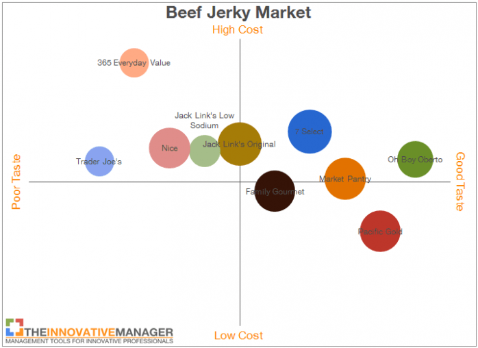
With the map completed, now we can do some structured marketing and innovation analysis.
Using Perceptual Maps In Marketing And Innovation
There are three main ways we can use this map:
- Value Analysis – make inferences on perceived value and create estimated value curves based on current market norms
- Competitive Analysis – know how a certain brand stacks up against the competition and possible competitive scenario analysis
- Innovation Opportunity Analysis – look for open spaces or territory where a new product could potentially be positioned successfully
Value Analysis
When doing value analysis, the first thing to look for is a correlation between price and quality. In this example I’m assuming taste is the biggest component of quality for Beef Jerky. As I looked over the products in the beef jerky market, several questions came to mind, including:
- If Oh Boy Oberto tastes the best, why isn’t it priced the highest? What other variables not shown in this map could explain a disconnect between price and taste?
- Why is Pacific Gold priced the lowest when it tastes second best among all the jerky brands?
- What can explain 365 Everyday Value being so far out of the norm versus all other brands?
These questions intrigued me and when I looked back at the original data set from Consumer Reports I noticed they included the stores where most brands were sold. So to better understand the data, I labeled the stores where each brand was sold. I did this by hand but I could also have done this using text boxes within the chart itself. I made an assumption based on my own shopping experience for those brands that didn’t have the stores labeled – Oh Boy Oberto and Jack Links. In my experience, Oh Boy Oberto is primarily available at stores like Walmart or Kroger. Jack Link’s on the other hand, seems to be available primarily in gas stations or convenience stores. As I plotted all this information on the perceptual map, the overall data set seemed to make a lot more sense – see image below:
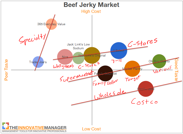
With the distribution channels labeled, the pricing for each brand made a lot more sense. Given that wholesale is direct from the manufacturer we would expect those prices to be lower than supermarket and convenience store prices. Convenience stores often demand the highest margins on their products which makes sense why those prices are the highest.
With the distribution channels properly called out, the only two odd balls left are Wallgreens (which I would put somewhere between supermarkets and C-stores from a margin perspective) and 365 Everyday Value which is sold at Whole Foods. Whole Foods and Trader Joes can command a higher premium simply because of other variables not listed on this map such as the health benefits of lower sodium and organic sources.
Competitive Analysis
The key to competitive analysis is to thoroughly understand the competition and close any gaps between your position and your competitors through innovation. This perceptual map provides a good snapshot of how some of the brands can improve. For example, lets suppose we manage the Jack Link’s Original brand. Assuming that most customers value reduced sodium content in beef jerky, from the map we notice a clear disadvantage for Jack Link’s Original. The issue is not that the taste is ranked as mid-range but the fact that a better tasting alternative is available with noticeably lower sodium content.
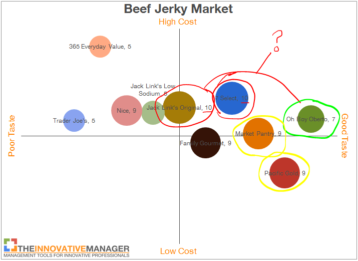
Even if Jack Link’s were the market leader being aware of this discrepancy is an important part of maintaining a leadership position in an industry.
Innovation Opportunity Analysis
The final way we can use the perceptual map is as an innovation tool to generate new ideas for a particular product or brand. The best way to do this is to follow two basic steps:
- With just the map as a reference, what product could I create that would have a reasonable chance of winning against the competition?
- What open spaces are there on the map where adding a product in that space could be a viable solution for some customers?
To answer the first question, let’s return to the situation Jack Link’s is in. If Jack Link’s were concerned over the fact that they were rated lower on taste yet have higher sodium content than Oh Boy Oberto, then one way to deal with it would be to create a new product that addresses those issues. For example, if Jack Link’s were to initiate a new product development program and specify equivalent or lower sodium to Oh Boy Oberto and equivalent or better taste – that could be a successful innovation for them. This example is illustrated in the graphic below.
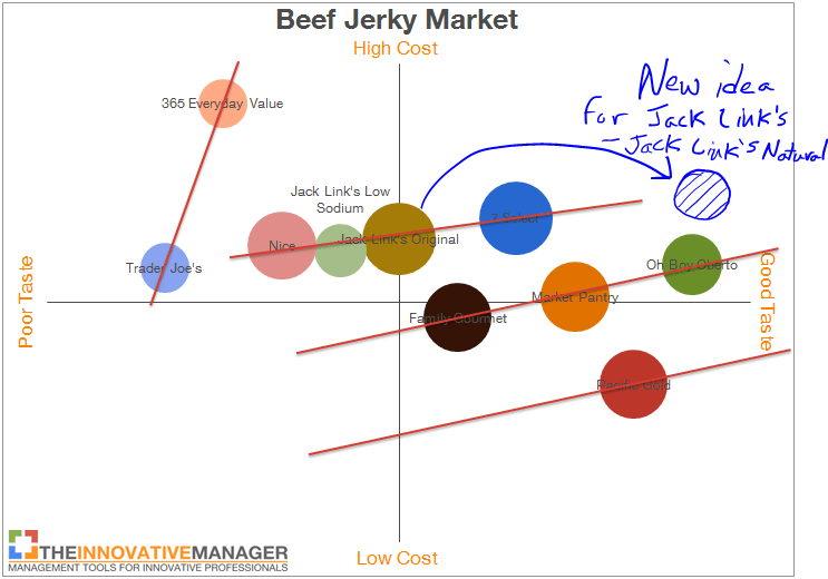
As I thought about this opportunity for Jack Link’s, I noticed that the main difference between Oh Boy Oberto and Jack Link’s is that Oh Boy Oberto uses all natural ingredients whereas Jack Link’s has many artificial ingredients included. After a quick review of Jack Link’s website, I couldn’t find a natural version of their jerky. Seems to be a great opportunity for them – create a natural version of their popular Original flavor and brand it as a healthier alternative.
The other way to use the perceptual map is to look for open spaces and determine if a product in that area might make sense. If we switch gears and now assume we are a brand manager for Oh Boy Oberto and are looking for new ways to grow sales, it may be useful to think more about further leveraging their highly-ranked taste by introducing their product to new distribution channels. For example, based on my limited anecdotal experience, it seems that Oh Boy Oberto is stronger in supermarkets than C-Stores. This could be simply a matter of packaging – Jack Link’s provides a single package that is easy to eat on the road while Oh Boy Oberto typically comes in bags. If Oh Boy Oberto came up with a single pack of it’s natural jerky, priced it along the same price/value slope and sold it through C-Stores, they could have a hit. The challenge then would be developing strong relationships with popular C-Store chains to enable distribution.
This idea is represented on the map below.

Conclusion
Perceptual maps are a great tool to use for initial market analysis, positioning and innovation thought experiments. One thing you’ll notice from this example of beef jerky is that the ideas we generated were not particularly groundbreaking though still potential growth opportunities. This is because perceptual maps are not necessarily the right tool for generating breakthrough or disruptive ideas. In referencing the “Four Types of Innovation” that I have written about before, these two ideas for beef jerky fall squarely in the categories of sustaining (Jack Link’s Natural idea) and new market (Oh Boy Oberto single pack at C-Stores idea) – ideas that can come naturally after thorough analysis of a perceptual map. For basic market analysis purposes, perceptual maps are incredibly valuable tools and I hope you find them useful in your marketing and innovation efforts!
Jake
12 Steps to Creating A New Innovation From Scratch - FREE Video Training
Over 100 Slides Free and Downloadable As A PDF


That was extremely helpful!! Great job and thanks for sharing your knowledge!
that was awesome, thank you.
Realy Helpful, TFS
Really helpful to understand perceptual mapping….
Very Helpful to understand perceptual mapping. great job thanks for this 🙂